UX/UI Typography App
Futura Lab is an ongoing academic project developed at Arizona State University, created to explore how users interact with typography in a simple, playful, and visually clear way. The concept centers on giving designers and curious learners a space to experiment with stroke variations in the Futura typeface, starting with a focused prototype built around the letter W. The work blends UX research, sketching, and high‑fidelity prototyping to shape an interface that feels clean, intuitive, and open to creative exploration, with early sketches guiding the structure before moving into digital design. As the project continues to evolve, it reflects a growing understanding of how to balance usability with visual expression while laying the groundwork for expanding into more letters and features.
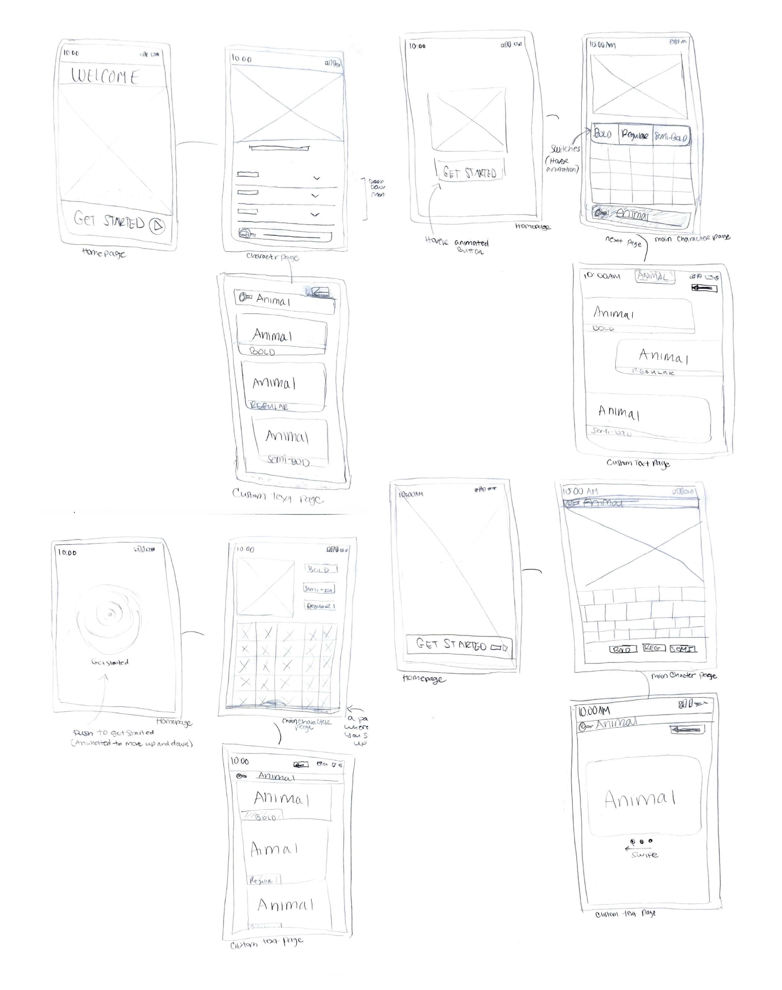
The sketch phase for Futura Lab, I was experimenting with different layouts and interaction ideas to see what worked best. Working quickly on paper helped me compare options, explore navigation patterns, and understand how users might move through the app before committing to a direction. Even though the sketches were rough, they played an important role in shaping the clearer, more structured wireframes and prototypes that came next.
I created a low-fidelity wireframe to help define the overall layout and structure of the design. It allowed me to focus on content hierarchy and page flow without getting distracted by visual details. Only key pages were created at this stage to validate the main user journey and ensure the layout decisions made sense before moving into higher-fidelity designs.
Thereafter, the high-fidelity design was created by adding color, refined visuals, and interactive elements to bring the app to life. This stage focused on enhancing usability, clarity, and visual consistency across the experience. A clickable prototype was created to simulate real interactions and user flows, allowing users to test the design and better understand how the app functions end to end.
Give me a try!